
My creative process journal
Expanding my project from semester 1, this semester I wanted to research deeper on how I can fuse futuristic elements and sustainability together.
WEEK 1 : Proposing Design Concept and Inspiration
This semester I wanted to expand the idea of futurism and sustainability together. I decided to turn my current design solution and expand it to a campaign and collection. Before consultation, I did some research and some inspiration pictures.


This Balenciaga campaign represents a different and dematerialized world, where the metaverse codes are not visible yet they are everywhere. The result is at the same time dramatically sharp and delicate. I loved the idea of the dystopian imagery of augmented bodies and the apocalyptic upper hand of technology over man. A sort of sci-fi futurism that continues the trend of the presentation of the FW21 collection transformed into a video game.

During my consultation and sharing our ideas with my lecturers, we brainstormed a few ideas together and one idea that really made me interested was the idea of chain-mailing which was pioneered by Paco Rabanne. Since I was using recycle denim garments, the idea of chain-mailing denim fabric will be really unique.
At the same time, I also can incorporate other types of fabric such as iridescent or lame materials to enhance the effect of futurism. I need to take into consideration that the pieces I design has to be wearable and cannot be too avant garde.
I came with an inspiration board to help me with my sketches and I wanted to research further on the idea of futurism from the 70s. (Space-Age Fashion)

WEEK 2: Proposing sketches
This was my first few sketches inspired very much by large cut outs and the idea of incorporating chain-mail into the garment. I wanted to still keep the elements of denim but change it to something more sci-fi and futuristic. However, after sketching I realised I needed to do more research on retro futurism as I was having a creative block and could not think of other ideas.
RESEARCH
Retro Futurism - Past version of the future
It is remembered primarily for its optimistic mood that fused modernist concept of scientific progress and technology.
It has elements of pop culture and a playful science aesthetic. Embodies the ideas of freedom, liberation and hope that makes future exciting and full of potential.

Retro futuristic art has an exaggerated illustration that shows the influence of depictions of the future. It had freedom, hope and liberation.


KEY FASHION DESIGNERS - PIERRE CARDIN & PACO RABANNE
Paco Rabanne polished chain mail. He was eccentric, eager to experiment sufficiently confident in his abilities. His collection and pieces were described as 'unwearable collection'. It was heavily influenced by the surrealist and dada movements. He experimented with neon leather, aluminium, chainmail, rubber, plastic and paper.

Paco Rabanne’s Craft Techniques From the 1960s Inspired the Spring 2021 Collections


Pierre Cardin Space Age Fashion:


André Courrèges from the 1960s used bright colours and textiles like lycra, vinyl and PVC.
He reflected the utopian techno centric vision. He also followed the idea of retro futurism coming from the roots of youth rebellion against polite society.


Types of silhouette:
stream-lined, sleek ergonomic designs and astronaut like garments.
Space Age colours:
Silver, impractical whites, metallics
Types of genres/subcultures:
Cyberpunk, Steampunk, Diesal punk, Atompunk (1950s) and Raygun Gothic

PAST AS SEEN FROM FUTURE OR
FUTURE AS SEEN FROM PAST
Sketches after research:

During consultation, we chose a couple of designs we liked and I was advised to develop the designs further from that. I had to also be mindful of not moving further away from my initial idea of reusing elements of denim garment. Thus, I was told to incorporate more denim elements on my design
WEEK 3 : Further development sketches
USER PROFILE
I created a user profile, to better understand the aesthetic of my user and the lifestyle of my user. It helps me to step into the shoes of the user or customer during my design process.
DEMOGRAPHICS
Age: 25
Gender: Female
Income: $ 4000
Education: Degree in Marketing
Employment: Public relations manager and part time influencer.
Social Background: Influencer and popular in social media

PSYCHOGRAPHICS
Interest: Fashion, makeup, styling and going for events and meeting other personalities.
Personality: quirky, whimsical and easy going.
Lifestyle: Going to PR events and meeting influencers part of the job and on weekends to detox she visits the beach and the gym.
More research referencing sci-fi and futuristic films

MATRIX 1999 FILM
Sunglasses, a sweeping dark trench, patent leather skimming the body - all in black - it was a look that invaded popular culture on the cusp of the new millennium, influencing fashion designers and sci-fi geeks alike. The costumes of The Matrix were, for better or for worse, a cultural phenomenon that defined the era's idea of cool.

GATTACA (1997 FILM)
A tale of a eugenics-ruled future, Gattaca was made in the midst of the ultra-minimal trend arc of the 90s. Costume designer Colleen Atwood reportedly recut suits from the 30s and 80s (sampling the 40s) in modern fabrics. There's a retro romance within the extremely conservative sparseness that feels akin to Miuccia Prada's fascination with the 30s.


The Costumes from Gattaca Inspired Ferragamo’s Autumn/Winter 2021 collection
BLADE RUNNER 2049 (2017 FILM)
This film is 80s fashion incarnate, a moving editorial for all the futurist trends of the era. Michael Kaplan's costumes, with 40s film noir and overtly futurist elements, codified the fashion trends of the era from Montana to Mugler.


Further development of sketches:
During my consultation last week, I was told to explore on the idea of unitards with outerwear with massive zippers and more on the idea of hoods and capes. I can also include the idea of fraying and try fraying a small sample of denim to see how it will look.


After consultation, I had to explore on more ideas of bottoms as I did not have much bottom or pants design. I was glad that my sketches were alright and they fitted right on to the theme I was going for.
Sketching more bottom/pants designs:


I included more details such as fraying on cutouts, the use of metal rings and rivets, belt buckles and more waistband and belt loops into the garment. I ensured that the designs were wearable and yet looked futuristic.
I personally liked doing this designs and having reference images from my research from film costumes and 1970s space age fashion really helped me to further develop my sketches. I wanted my silhouette to be stream-lined and very structure. I wanted to continue the idea of exploring into cut outs from last semester and also on adding interesting and unconventional ways of adding details of denim into the garments
FRAYING SAMPLE ON SKETCHBOOK

WEEK 4 : Design Selection


During the consultation, the skirt from the right design and the top from the left design was chosen together. I was told to make some changes such as the neckline for the top instead of a flap, make it into a straight cut with a zipper. For the skirt there wasnt a need for a straight seam in the front but instead add a zipper at the back. For the comfort of the wearer, I had to make the neckline lower. I also decided to add some patch pocket at the back of the skirt
This was the final front and back design for now when I merged the top and bottom together. I added a slight slit at the sides of the skirt, so there is more ease when the user is walking. I added some style lines for the back design so I can incorporate double top stitching. We are still considering if I want to add a hole on the underarm or just leave it as it is. The idea now is to wear a bralet under the top to avoid any under bust being exposed.
After finalising the sketches with my lecturers during consultation, I decided to do a simple technical flats using illustrator to put different shades of denim together. Since I was using recycled denims, I will be receiving different range of colours and textures of denim garment so I wanted to see how the different colours will look together. After putting them together, I really liked how well the colours compliment each other.
WEEK 5 : Design Update
After brainstorming and researching, I realised that my top chosen as the selected design was too similar to the toile I did in semester 1. I decided to change the design of the top mainly exploring on the collar. I took inspiration from a biker jacket. I was not intending to a tailored collar with lapels but I wanted to do shirt collar but when unbuttoned it mimics a lapel.


This was the vision of my sketch on how it looks buttoned and unbuttoned. To achieve this there would be overlapping of fabric and I have to extend my centre front for it to open up as lapels.

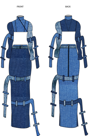
FINAL sketch of selected design
DETAILS:
TOP - Shirt collar inspired by biker jacket with added snap buttons and rivets
TOP - curved shaped sleeves with belt loops
TOP -back cut and sew decorative seam
SKIRT - double patch pocket on the back of the skirt.
SKIRT - open-ended zipper at the back
SKIRT - double waist band, thin and thick waistband
SKIRT - belt loops on the skirt
More sketches for collection

More sketches for collection selection. I did more dresses and jumpsuits for sketching because I was lacking them in my previous sketches. Collection has to be cohesive so I decided to follow the same style of sketching. The sketches for this were mainly inspired by unconventional pairing such as collars used as waistband for pants, pants actually looking like skirt, skirt as mini dresses.
WEEK 6 : Collection

This was the selected designs for my collection, I had to make some changes to the designs so that as a collection they look more cohesive. They had to have similar elements such as the loops, hoods, long zippers and seams.

Made some changes as told from the previous pictures and lined them up as a collection with my chosen design to see if they look cohesive together. There are hoods, belt loops, similar shoulders and some denim element in each garment which makes it look more together in the collection. After this was confirmed I went on to design the back.


WEEK 7: Denim Fabric Manipulation (Metallic Foiling)
Inspiration images:

SILVER METALLICS TREND
I wanted to incorporate silver and metallics in my garment because it gave a sense of a futurist escapism in fashion with modern metallics. During the space age fashion in the 60s, most designers used metallics and silvers in their collections.
Space references can feel like an escape, a projection of what we could be living like in the future, a chance to correct or improve what we are doing now.
According to Tagwalk, just this week there was a 78% increase in metallic looks on the Autumn/Winter 2023 runways at London Fashion Week. This means the trend is set to keep its prominence.
What I want to execute for my designs? Inspiration Images:


Trying on a small sample of denim and
ironing on the metallic foil with bonding paper, but I do want a scattered look, thus I thinking used fabric glue would be a better idea.


FOILING WITH GLUE FOR A SCATTERED EFFECT


Justifying futurism with metallics foiling?
The metallic is still our most explicit expression of the futuristic: Steel nails evoke cybernetic component, chromed lips a space-age prophylactic. The metallics shows the relationship between machine and the human body. It shows the power and the future together, and fashion occupies that space at the edge of the body.
WEEK 8/9 : Fashion catalogue mindmap and research

Doing a look-book that is inspired by fashion magazines with minimal words and more pictures.
I wanted my model illustration to look very AI inspired and perhaps look like they are in space wearing astronaut helmets.
As they read the catalogue/ look-book, I want to have an interactive experience and let them feel a futuristic experience and still learn about sustainability.

MINIMAL COVER PAGE
- Magnifying glass initiates an astronaut helmet
- Cut out on the cover page and insert a magnifying glass. It also magnifies the image the viewer is looking at symbolising a telescope.
- A strong message would be tell the readers that any harm done to the environment even if its a small action it takes effect on a larger scale.
Photoshoot inspiration images:


FASHION PHOTOSHOOT VS AI RENDERED IMAGES
- Background: metallic futuristic scifi world
- Face more digitalised to fit the artificial intelligence and an augmented reality
- To let the viewers understand the concept fully in a futuristic world.
LAYOUT PLANNING
TITLE COVER PAGE > SUSTAINABILITY > DESIGN CONCEPT > MAIN GARMENT> ILLUSTRATION OF COLLECTION> MESSAGE OF SUSTAINABLE DENIM


WEEK 10: Fabric market research & Toile evaluation
I wanted to learn about the different types of denim, so I decided to go to a fabric warehouse to really understand the different compositions of denim fabric. At the same time when using the different donated fabric, I can tell the type of denim that I am using. There were so many denim fabric in the warehouse ranging from hard japanese denim, denim chambray, cotton denim, raw denim, waxed denim, denim dangary and stretched denim. The range from different colours as well from really dark faded blue, indigo blue to really light blue.


DRAPING DIFFERENT SHADES OF DENIM TOGETHER
I used my donated fabric collected from past year students to drape different shades of denim together and see how they complement each other as a whole garment together. I did not want the differences between the shade be too much that they outshine each other as one, I wanted them to look cohesive together and yet unique. I wanted to avoid very bright indigo colour range for the garment and go for a more faded off denim colour range.
For the sleeves, I decided to use a lighter shade and a thinner fabric due to the shape of the sleeves, perhaps a denim chambray. For the top, I opted for a darker shade of denim and for the skirt a middle shade colour range that complements both the top and the skirt.


Toile evaluation


WEEK 11: User testing and review

I photoshopped my final selection of fabric together before I went on to sew my final garment and cut the fabric. I wanted to see as a whole garment if they complemented each other and look cohesive together without the fabric outshining each other.
User testing and review


I sent out a short open-ended survey to better understand my potential user requirements and if they liked the garment. I wanted to understand the pains and gains and if they had any modifications for me or what were their favourite parts of the garment.


WEEK 12- WEEK 16
Final garment completion


After finishing my top with my actual fabric, I was really happy with the final product however, I decided to remove the belt loops on the strap because it was twisting the strap due to the weight and I felt like there was also too much going on adding the belt loops to the straps.

FABRIC SWATCHES OF MY ACTUAL GARMENT


This is my completed skirt, I added interfacing to my straps after this so that the straps does not look flimsy and more rigid. It also stopped twisting after adding the interfacing.
MODEL FIT AND TRY ON


During the fitting, I was happy with the proportions and how the straps draped on the sleeves and the skirt, model was also comfortable walking in it. I felt like the garment was complete and was cohesive together.
PHOTOSHOOT MODEL FIT AND TRY ON


BUTTONED AND UNBUTTONED VERSION OF THE TOP
Photoshoot concept and ideas


I wanted to do a photoshoot to included pictures of my garment in my look-book. The whole idea of the photoshoot was inspired by streetwear fashion photography and Japanese street fashion. I took most of my inspiration from Japanese archive 90s magazine 'fruits magazine'. I chose this location (peninsula street) because I liked the skyscrapers and the busy street, also it looks like Brooklyn city and busy street which is what I envisioned. I wanted the shoot to be very versatile and candid where my model is just walking through busy streets.
'FRUITS MAGAZINE' ARCHIVES


UN-EDITED PHOTOSHOOT IMAGES


SNIPPET VIDEO OF GARMENT

Co-creation partner
Collaboration with Project Anew, How to collaborate as a SG-ECOFUND project?


Youth-led initiative that aims to give back to the community through the sale of thrifted items. Project Anew is an organisation that follows a moto setting the world a new, one preloved at a time. It aims to intertwine the act of giving with fashion. A team founded and led by youths aged 21 and below, aiming to introduce and create interest among fellow youths on topics such as sustainability and philanthrophy.
Project Anew’s first event, The Marketplace, had a turnout of approximately 650 people and raised 5302 SGD over three days for Food from the Heart by selling thrifted goods.

Using the collaboration with project Anew, I wanted to propose a shared exhibition space and market sale to see one-of-a-kind denim garments that are made through up-cycled donated denim.Since there has been no sale of up-cycled denim garments in their past events this will be a great opportunity for me to reach out to my target audience.
The shared space will give youths an opportunity to connect, exchanged ideas on their thoughts & address issues on sustainability. This platform will be useful to raise awareness and educate about sustainable denim and denim wastage.
My main goal of this event is to allow youths to understand the harmful effects of denim production so that there will be less throwing away and to show that up-cycle denim projects can also be timeless and stylish and one-of-a-kind made just for you.
The picture on the right is a proposed poster of the collaborative event.
Collection illustration and materials
LOOK 1 :
DENIM MIDI CUT OUT DRESS
MATERIALS:
METAL ZIPPER
METAL RIVETS

LOOK 2 :
HOODED CORSET DENIM JUMPSUIT
MATERIALS:
METAL ZIPPER
METAL RIVETS
DENIM BUTTONS

LOOK 3 :
DETAILED SIDE SLIT TOP & DRAPED MAXI ZIPPER SKIRT
MATERIALS:
METAL ZIPPER
METAL RIVETS
DENIM BUTTONS

LOOK 4 :
HOODED DRAPED MINI DENIM DRESS
MATERIALS:
INVISIBLE ZIPPER
METAL RIVETS

LOOK 5 :
BIKER JACKET INSPIRED STRAP TOP &
STRAPPED STRAIGHT DENIM SKIRT
MATERIALS:
METAL ZIPPER
METAL RIVET

Design concept and collection line up

'DENIM REVAMP' a collection inspired by futurism and up-cycling old discarded denim to create one-of-a-kind pieces.
Up-cycling is the birth of revival through clothing and the term “one-off” refers to something that is done or created only once, and often quickly, simply, or improvisation-ally.
The ‘one-off’ element gives the user a unique and a different experience. It gives them a sense of attachment created just for them. Each piece in the collection will be created only once, client based , and unique on its own. The designs will also not be repeated to show how unique and different each piece can be.
I am using futurism as my ideology while designing this collection because personally I believe that it was remembered primarily for its optimistic mood and embodied the ideas of freedom, liberation and hope that makes future exciting and full of potential. I wanted to take an optimistic approach to raise sustainable concern through futurism among my consumers
Media: Lookbook pages


First page cover printed with holographic paper and cut out circle on the front page. To insert magnifyinf sheet at the back to see throught the second page.


FRONT cover page with magnifying sheet and holographic paper